Kohl’s Brand
FAMILIAR . . . YET SURPRISING.
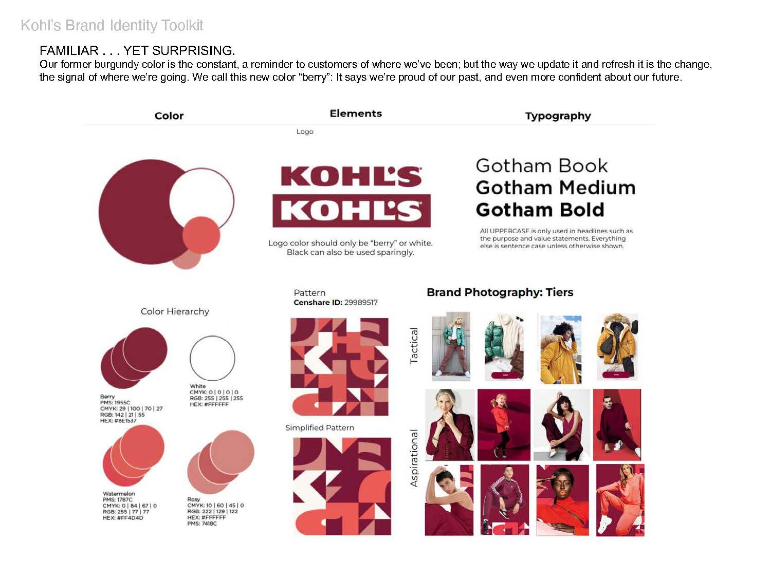
Color
Our former burgundy color is the constant, a reminder to customers of where we’ve been; but the way we update it and refresh it is the change, the signal of where we’re going. We call this new color “berry”: It says we’re proud of our past, and even more confident about our future.
Pattern
Pattern also drives brand recognition while ensuring freshness across formats. We’ll leverage our most recognizable asses: color and logo, then scale and crop them to create a range of ownable, impactful patterns that make the most of each moment.
Identity
Store Branding
Environmental Design
Digital
Social